

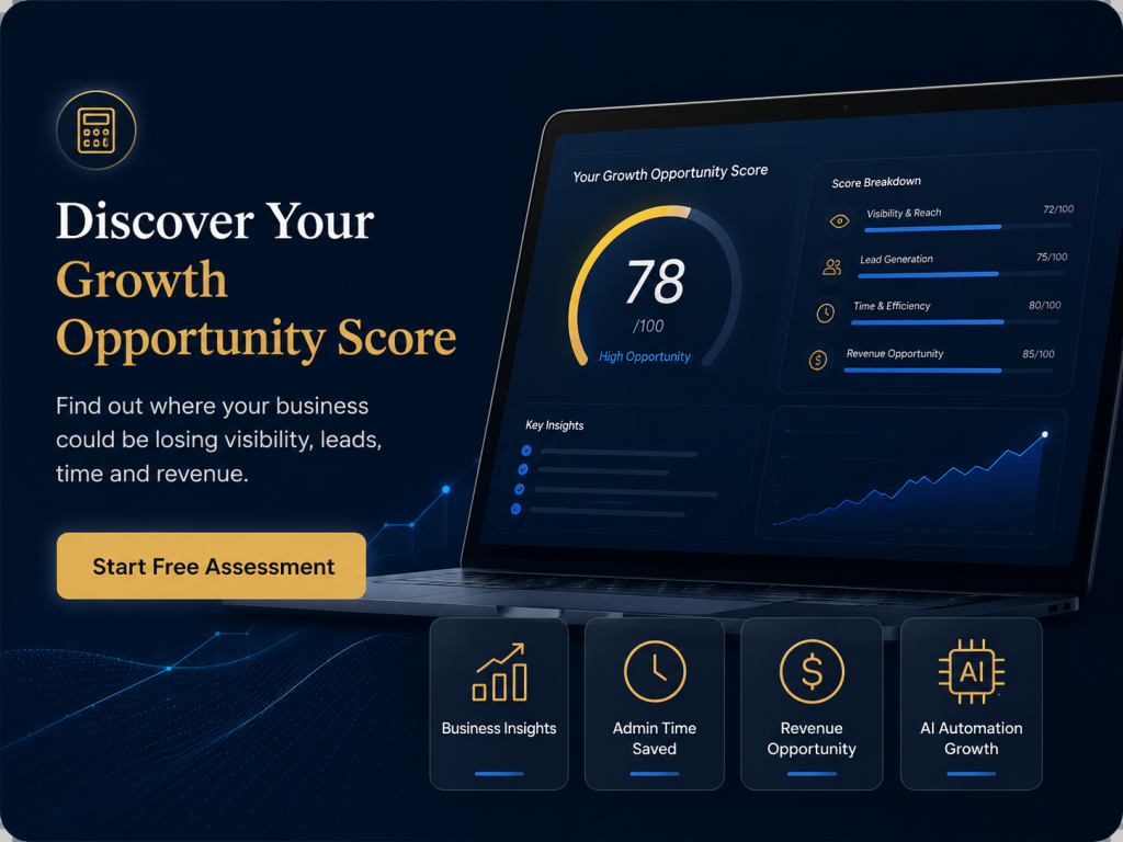


Modern marketing produces an overwhelming amount of data. Impressions, clicks, sessions, bounce rates, engagement, reach, conversion rates and a dozen other numbers, all updating constantly. Faced with this flood, many business owners do one of two things. They either ignore the data entirely, or they stare at it anxiously without knowing what actually matters. Neither helps. More data is not the same as more clarity. A good marketing dashboard cuts through the noise, answering a few important questions at a glance so you can make decisions with confidence rather than drown in detail.
This guide explains how businesses can build and read a marketing dashboard that genuinely helps them run the business, instead of adding to the confusion.
Start with the questions, not the numbers
The most common mistake is to build a dashboard around every metric a platform offers, then try to make sense of it. The better approach is to start with the questions you actually need answered, and only then choose the numbers that answer them. For most businesses, those questions are simple. Are enough of the right people finding us? Are they turning into enquiries? Are those enquiries becoming customers? Is our marketing producing more value than it costs? Start with questions like these, and the dashboard becomes a tool for answering them rather than a wall of numbers. When you build from questions, every metric on the dashboard earns its place by answering something you care about, and the rest, however tempting, can be left off.
Most metrics do not matter to you
A liberating truth is that most of the metrics available to you do not matter for your decisions. Platforms report dozens of numbers because they can, not because you need them all. The vast majority are detail that does not change what you should do. A useful dashboard deliberately ignores most of what is available and focuses only on the handful of numbers that actually inform your decisions. Trying to track everything guarantees you will drown, because the important signals are lost in the noise. Choosing to ignore most metrics is not laziness, it is discipline, and it is what makes a dashboard usable. The goal is not to monitor everything, it is to see clearly the few things that guide your business, which is a very different and far more valuable thing.
Focus on outcomes, not activity
Metrics fall broadly into two kinds, activity and outcomes, and confusing them is a common trap. Activity metrics, like impressions, reach and clicks, describe what happened, but not whether it was worth anything. Outcome metrics, like enquiries, customers and value produced, describe the results that actually matter to your business. It is easy to feel good about high activity numbers while the outcomes that pay the bills stay flat. A dashboard that helps you run the business leads with outcomes, enquiries, customers, revenue, cost per result, and treats activity as secondary context. When you focus on outcomes, you judge your marketing by what it produces rather than how busy it looks, which keeps you honest and points your attention where it belongs.
Look for trends, not daily noise
Marketing numbers bounce around day to day for all sorts of reasons, and reading too much into any single day is a recipe for anxiety and bad decisions. A good dashboard is read for trends over sensible periods, not for the noise of individual days. Is the direction improving, holding or declining over weeks and months? That is what matters, far more than whether yesterday was up or down. Reacting to daily fluctuations leads to constant, pointless changes, while reading trends lets you see what is genuinely happening and respond to real shifts rather than random variation. Training yourself to look at the trend rather than the daily number is one of the most valuable habits in reading a dashboard, because it separates signal from noise and keeps your decisions steady.
Make it something you actually use
A dashboard is only valuable if you actually look at it and act on it, so it needs to be clear, simple and current enough to use. A cluttered, confusing or out-of-date dashboard gets ignored, however sophisticated it is. A simple one showing your few key outcomes, kept current, ideally through automation so it maintains itself, becomes a genuine decision-making tool you consult regularly. The aim is a dashboard you glance at, understand immediately, and act on, not an impressive artefact nobody reads. Simplicity and currency are what make a dashboard used, and a used dashboard is the only kind that helps. Building it into how you actually run the business, rather than treating it as an occasional report, is what turns data into better decisions.
A practical example
Consider a business owner who feels overwhelmed by marketing data. Every platform shows dozens of numbers, and they either ignore them all or stare anxiously without knowing what matters. They have plenty of data and no clarity, and their decisions are no better for all of it.
They rebuild their approach around questions. They decide the few things they actually need to know, whether enough of the right people are finding them, whether those people become enquiries, whether enquiries become customers, and whether marketing produces more than it costs. They build a simple dashboard around just those outcomes, ignoring the mass of activity metrics that do not inform decisions. They read it for trends over weeks rather than reacting to daily noise. And they keep it current automatically so they actually use it. The change is significant. Instead of drowning, they glance at a clear dashboard, understand their marketing at once, and make confident decisions based on outcomes and trends. The flood of data that once paralysed them has become a handful of clear signals that guide the business, simply because they focused on the questions that matter rather than the numbers that do not.
How Webrr Digital can help
Webrr Digital helps businesses grow through practical digital systems that bring together websites, SEO, AI visibility, automation and advertising. We help you cut through the noise, starting from the questions that matter, focusing your dashboard on outcomes rather than activity, and keeping it simple and current so you actually use it. If your marketing data overwhelms rather than informs, our growth systems approach is built to give you clarity.
Frequently asked questions
How do I stop feeling overwhelmed by marketing data?
Which metrics actually matter?
What is the difference between activity and outcome metrics?
Should I check my dashboard every day?
What makes a dashboard actually useful?
Want clarity instead of a wall of numbers?
A focused dashboard turns overwhelming data into confident decisions. If you want help building one you will actually use, the Webrr Digital team can set it up.